Channels are simple and cool. Channels are used to display website in different ways on different devices, phones, PCs, tablets...
SharePoint has one default channel and one master page to start with. If you, for example, add a new mobile channel, you can assign new mobile master page with different navigation and content to that channel. When the site is opened on a mobile phone, it will be displayed with mobile master page. This is a huge difference compared to SharePoint 2010 and altering browser definition file compat.browser in IIS to control mobile view of the site.
Top 5 things to know about Channels
1. Channels control which master page is used to show your site on for example iPhone or iPad. Channels are bound to master pages, and channels are bound to user agent string of device in use (phone, tablet or PC).
2. You can use Image Renditions with Channels
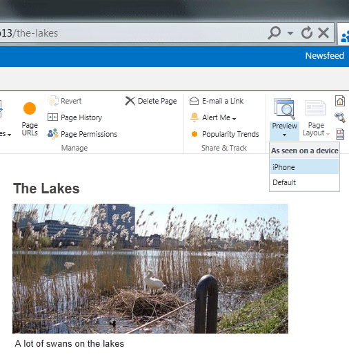
3. There is a Preview button in the Ribbon that you can use to preview the page in different channels. You can also add “?PagePreview=true&DeviceChannel=<channel alias>” in URL to preview the page
4. Channels make use of user agent string to detect a device
5. You can use channel’s Alias value in JavaScript code
How it works
I configured my Internet Explorer to show how the page looks like on an iPhone device.
I opened my IE browser and pressed F12. I clicked on Tools, Change user agent string, and chose Custom...:
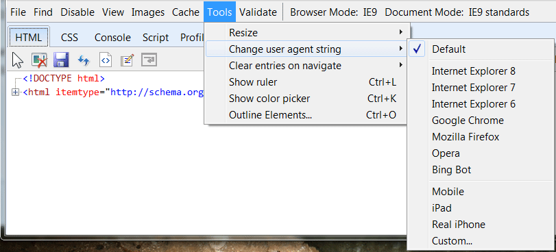
I wrote the following:
Friendly name: Real iPhone
User Agent String: iPhone OS
I opened Twitter and chose "Real iPhone" in Tools:
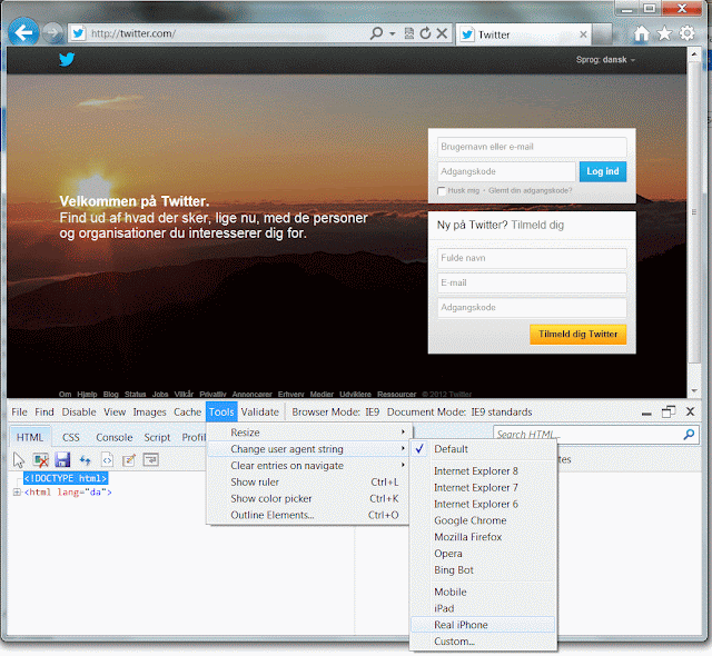
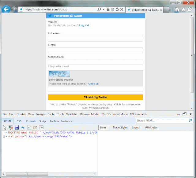
I also refreshed the browser, and I got this mobile edition of Twitter on my screen:
If you have IE11, press F12 and select Emulation:
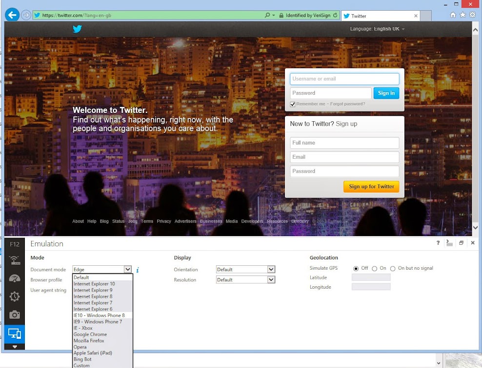
There is iPad, but no iPhone :-) I have to write a custom string here:

In SharePoint 2013, I can do the same. I opened a page and chose "Real iPhone":
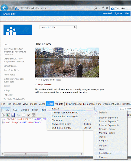
I refreshed the browser and got this page:
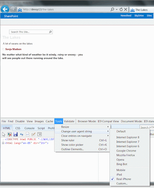
It is not magic. It is out-of-box SharePoint 2013 Channels functionality.
I simply defined "iPhone" channel on my SharePoint 2013 site.
There is a link "Device Channels" in Site Settings, right under Look and Feel:

Device Channels page is a list that allows you to add and manage channels:
![]()
The Default channel is already there when you create a site. I defined the name, alias and Device Inclusion rules for iPhone channel:
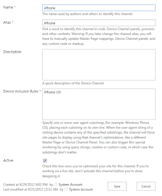
The text defined in Device Inclusion Rules is the same text that is defined as User Agent String in my IE browser.
Next step is to assign a master page to iPhone channel.
I made new master page and called it mobile.master. I clicked on Master page link in Site Settings and set my iPhone channel to use mobile master page:
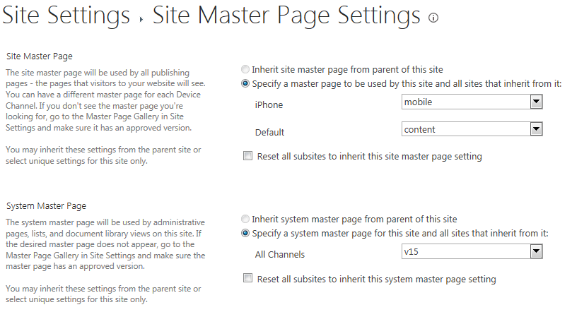
I described how I made mobile master page in my post about SharePoint 2013 Mobile.
The IE browser thing with user agent string that I just did is not the only way to view how your page will be displayed on mobile devices. There is a "Preview" button in the Ribbon with drop-down list of channels:
You can also add "?PagePreview=true&DeviceChannel=iPhone" to URL address and get the same result:
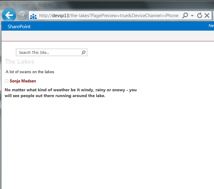
It means that you don’t have to target a different device with a channel. You can create a channel and assign a master page that contains different content than the content, displayed to all users. You can control when this content will be displayed by adding a parameter "?PagePreview=true&DeviceChannel=Special" in browser URL.
I configured my Internet Explorer to show how the page looks like on an iPhone device.
I opened my IE browser and pressed F12. I clicked on Tools, Change user agent string, and chose Custom...:

I wrote the following:
Friendly name: Real iPhone
User Agent String: iPhone OS
I opened Twitter and chose "Real iPhone" in Tools:

I also refreshed the browser, and I got this mobile edition of Twitter on my screen:

If you have IE11, press F12 and select Emulation:

There is iPad, but no iPhone :-) I have to write a custom string here:

In SharePoint 2013, I can do the same. I opened a page and chose "Real iPhone":

I refreshed the browser and got this page:

It is not magic. It is out-of-box SharePoint 2013 Channels functionality.
I simply defined "iPhone" channel on my SharePoint 2013 site.
There is a link "Device Channels" in Site Settings, right under Look and Feel:

Device Channels page is a list that allows you to add and manage channels:
The Default channel is already there when you create a site. I defined the name, alias and Device Inclusion rules for iPhone channel:

The text defined in Device Inclusion Rules is the same text that is defined as User Agent String in my IE browser.
Next step is to assign a master page to iPhone channel.
I made new master page and called it mobile.master. I clicked on Master page link in Site Settings and set my iPhone channel to use mobile master page:

I described how I made mobile master page in my post about SharePoint 2013 Mobile.
The IE browser thing with user agent string that I just did is not the only way to view how your page will be displayed on mobile devices. There is a "Preview" button in the Ribbon with drop-down list of channels:

You can also add "?PagePreview=true&DeviceChannel=iPhone" to URL address and get the same result:

It means that you don’t have to target a different device with a channel. You can create a channel and assign a master page that contains different content than the content, displayed to all users. You can control when this content will be displayed by adding a parameter "?PagePreview=true&DeviceChannel=Special" in browser URL.
Target all mobile devices with a Device Channel
Create new Device Channel and write $FallbackMobileUserAgents; in Device Inclusion Rules field.
SharePoint Device Channels are great, and I warmly recommend using them to, for example, define another top menu or another left menu in the master page for mobile channel. Here is an example of a SharePoint site that has responsive page layouts and no channels. It is video of ResponsivePages app that is available at Office Store:

No comments:
Post a Comment