Search This Blog

Sunday, June 20, 2021

How To Create Reusable Components in Canvas Apps with Already Available Controls

 We will work on two simple limitations on the current controls in Canvas Apps and create custom components to overcome those limitations.

1. A specific range cannot be set on the date picker control that would limit the users from selecting dates from a specific range only.

2. Power Apps currently limits the text input control to two formats i.e., text and number. We will create a custom component to support ‘regex’ as a general setting that can be applied to multiple input fields of the same format. Let’s get started. We will first create the components and then see how to use them on the canvas app.

Creating Custom Components

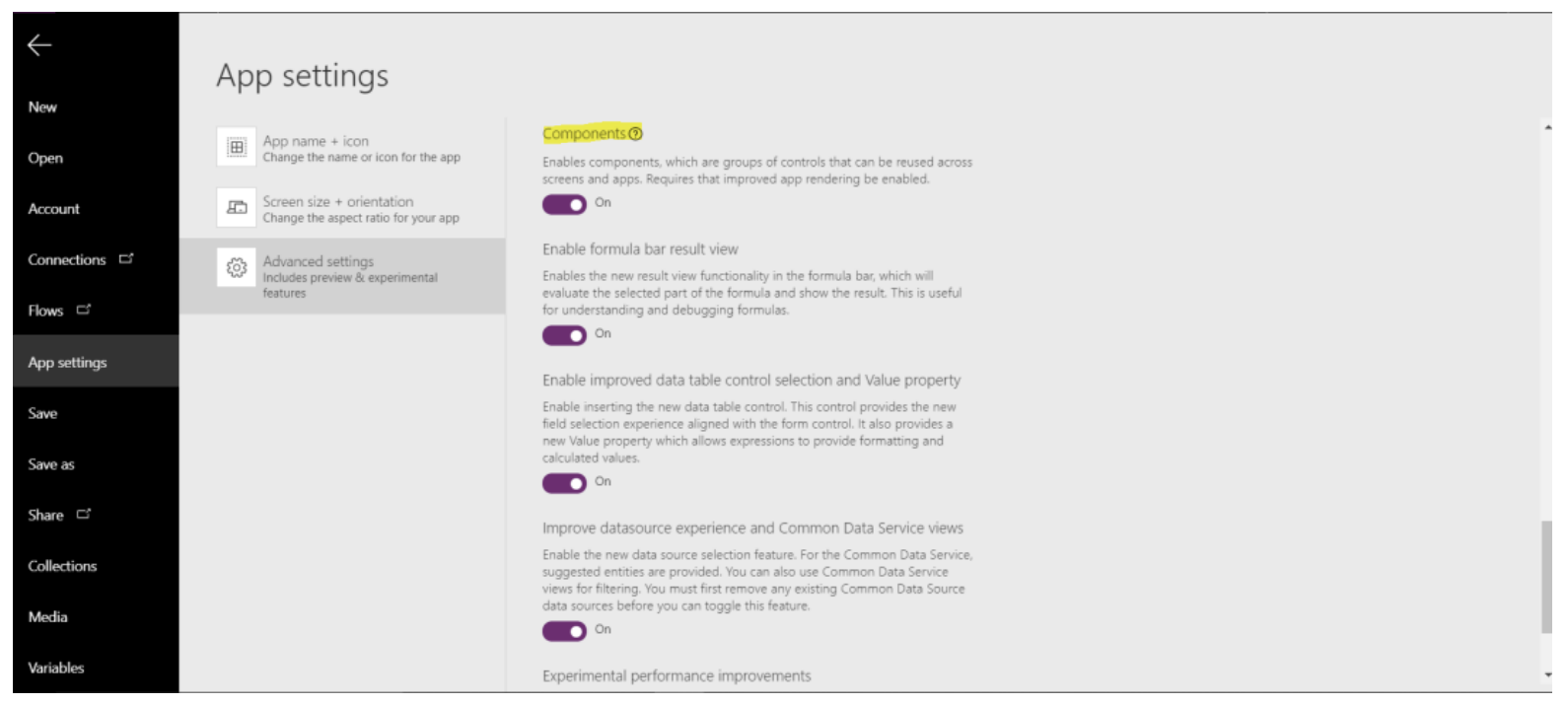
To create the components in the Power Apps app studio, we first have to enable ‘Components’ in the experimental features tab from the advanced settings of the app.
Creating Custom Components

Date Picker

The current date control allows you to restrict only the year while configuring the control. Using already available controls, we can design a component for the date control that enables restricting to a range of dates. The display of the date control component is based on a gallery and is explained in detail here. We will start by creating a few custom properties for the component. The idea behind this date control is to enable functionality to restrict users to select the date from a specified range. For this, I created a “start date” and an “end date” property of data-type “date and time”. I have also added properties to customize the color of the different sub-controls of the component.
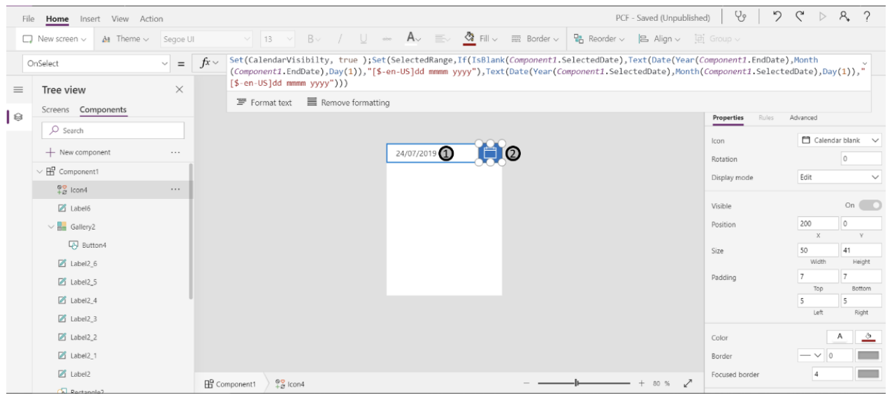
Date Picker

1. This is a label that displays the date selected from the custom date picker control component. The expression used on the “Text” property of this label:

Selected Date Label

2. This is an icon (‘calendar’) to expand the date picker. The expression used on the “OnSelect” property of this control:
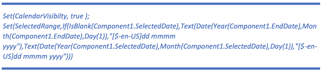
Icon Calendar

Explanation: The visibility of the calendar is set here based on the “CalendarVisibility” variable. “SelectedRange” is a variable that sets the context for the appropriate month to be displayed on the date picker.

3. Upon clicking this icon, the user is navigated to the previous month. The expression used on the “OnSelect” property of this control is:

Previous Month Navigation

Explanation: This evaluates the month label based on the current month on the date picker and the result is the previous month w.r.t to the current month. The expression used on the “DisplayMode” property of this control:

Display Mode

4. This is a label control and displays the selected month and year on the date picker.

5. Upon clicking this icon, the user is navigated to the next month based on the current month. The expression used on the “OnSelect” property of this control is:

On Select

Explanation: This evaluates the month label based on the current month on the date picker and the result is the next month w.r.t to the current month. The expression used on the “DisplayMode” property of this control:

Display Mode

6. This is a gallery of buttons to show days week wise in a row. The expression used on the “OnSelect” property of the button inside of the gallery is:

On Select

Explanation: The “dateselected” variable value is set by clicking this button. The expression used on the “DisplayMode” property of this button control is:
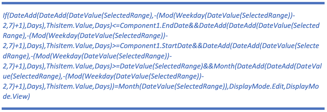
Expression used on DisplayMode

Explanation: Here is the date validation that checks if the date is within the range of the “start date” and “end date” properties and is of the currently selected month. The expression used on the “Text” property of the button control is: (This expression has been referred from this reference link.)

Date Validation

Explanation: This gets the date as per the day from the date picker. The expression used on the “Items” property of the gallery control is: (This expression has been referred from this reference link.)

Items property gallery control

Explanation: This created the 42 cells for the date picker inside of the gallery control. The expression used on the “TemplateFill” property of the gallery control is:

Template Fill Property

Explanation: This highlights the currently selected item (date) in the gallery control.

The selected date from this component can be accessed through the “SelectedDate” property. Note: The color properties defined are used in the component on all the individual controls to sync the color coordination amongst them.

Regex

The current text input control allows you to choose the input text format as a number or text only. We can design a component that allows implementing regex and based on the property (formatting required) the text input can be formatted or restrict the user to input the text in the type defined in the component. If the input text does not match the type chosen on the component, the field is reset, and a warning message is displayed to the user.
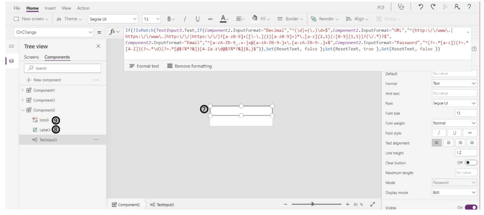
Regex

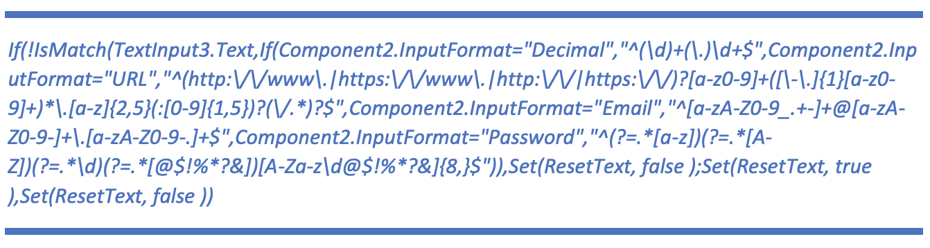
7. This is a text input control and the text format is set through the “InputFormat” custom property created on this component. The expression used on the “OnChange” property of this control is:
Setting Text Format

Explanation: The “if” statement checks the “InputFormat” custom property for the text input against the respective regex statement and resets the input if the regex is not matched. The expression used on the “Mode” property of this control is:

Expression on Mode Property

Explanation: If the “InputFormat” on this component is set to “Password” then the mode will be set to password in order to mask the user input.

8. This is a label that is used to display the warning message to the user in case of a mismatch of the input based on the “InputFormat” property.

9. This is an icon used to display the warning sign to the user in case of a mismatch of the input based on the “InputFormat property.

Email:

This is an “InputFormat” and the regex that this type of input is being compared to is:

Input Format Comparison

URL:

This is an “InputFormat” and the regex that this type of input is being compared to is:

URL Input Format

Password:

This is an “InputFormat” and the regex that this type of input is being compared to is:

Password Input Comparison

The password should include at least one or more of an upper case, lower case letters, a number, and a special character.

Number Format:
Number Format

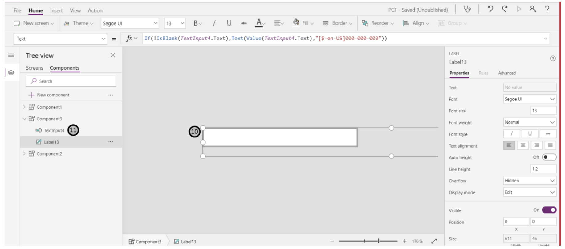
10. This is a label that displays the converted value based on the formatting defined for the input number. The expression used on the “Text” property of this control is:

Display Converted Value based on formatting

Explanation: If the text input is not empty, then the numbers entered will be formatted as “XXX-XXXXXX”

11. This is a text input control and the user will enter the number in this control. The “Format” property of this input is set to “Number” Note: The label in 10 is positioned in a way that it overlaps the text input control in 11. That is how the user can see the input formatted as set in the label.

Using the Custom Components

Currently, Power Apps restricts the use of a component in galleries, data cards, data tables, etc. We will design a custom sign up form and use the components created above to register a user and save the information on the data source.
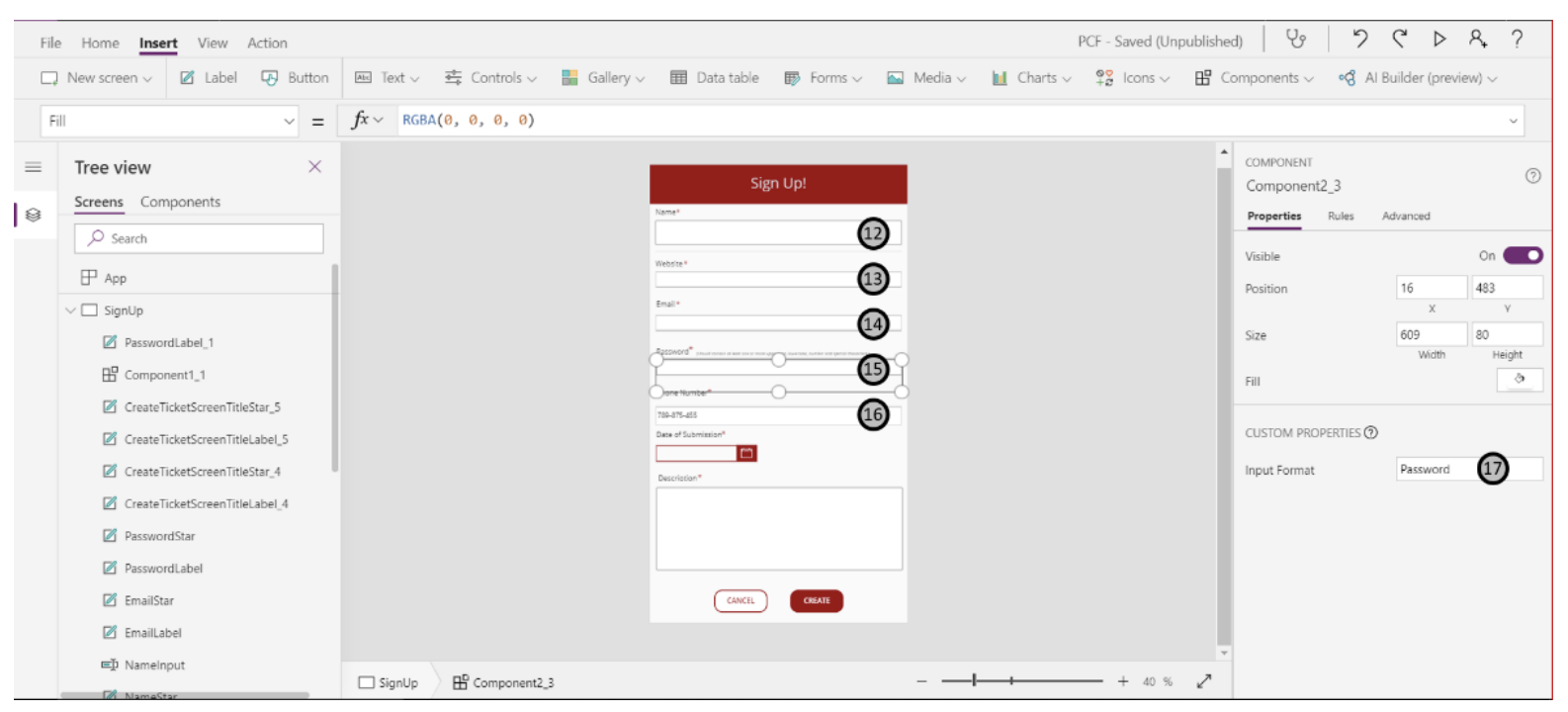
Custom Sign Up Form

12. This is a regular text input field that will allow users to enter simple text. The property of this control is set to “text”.

13. This is a component that we have created earlier and the property for this is set to “URL”. When users enter the URL, it is matched against the regex and if it is not in a valid URL format the field is reset.

14. This field expects the input to be in the form of an email address. The component created earlier is used for this control and the property is set to “Email”. If the input does not match against the regex for email, the field will be reset and a warning message will be displayed.

15. The property on the component for this is set to “Password”. If the input does not match as the regex set for the password (as mentioned next to the “Password” label), the field will be reset and the warning message will be displayed.

16. This input field expects the input in the form of a “Phone Number” and appends the ‘-’ to the numbers entered based on the regex configured while creating the component.

17. The custom property created for the component can be set here. For each of the above fields, the type of input (regex expression) is defined by setting this property.
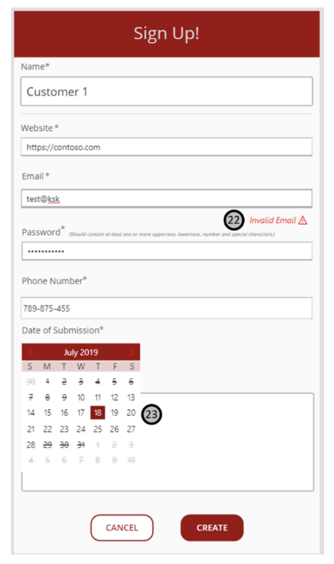
Sign Up Form18. This is the date control component and allows the user to pick a date by clicking on the calendar icon.

19. The custom properties for the date control component can be set here. The start date and the end date are configured to set a range of allowable dates. As an added feature, the colors for the individual controls within the date picker can also be configured here.

20. This is a clear field button and upon clicking this all the fields are cleared and the user creates a new entry.

21. This is a submit button and the user can submit their details by filling the form and pressing this button. Upon pressing this button, the details filled by the user are patched to the respective columns in the data source.

22. This is a warning generated for an inappropriate email address format that was entered by the user. As soon as the user clicks outside of this control, the field is reset.

23. This is the expanded date picker control and the dates that can be selected by the user are based on the start and end dates range configured in the app. The dates that cannot be selected are highlighted by the strikethrough and the buttons to navigate to the next/ previous months is disabled.

Overcome Delegation for Aggregate Function

 This has inspired me to create a new solution for not only reading >500 records, but performing aggregate functions >500 records and filters.


New challenges: 

  • When showing records in a gallery, only 100 records are presented at a time even if your formulas are delegable. You can get all 500 if you scroll more, but that's not a reliable solution.


Big idea:

  • Create a parent gallery with a table containing the whole numbers 1-1000 or however high you want.
    This will represent n, the number of groups of x amount of records to display in each row of the parent gallery.
  • Insert a nested gallery (child gallery) which will show records from your datasource in intervals of x records.
    For our purposes we will use x=100 since galleries can only show 100 records at a time.
  • Option 1: Collect the live table periodically, and perform calculations upon that collection as in my earlier solutions.
  • Option 2: Insert controls that will calculate upon each child gallery.


Limitations:

  • This solution is impractical and intense on resources since it's showing data live in gallery. So far, refreshes take ~5s for 1500 records
  • Changes may cause the nested galleries to flicker and visually reload all items.
  • This solution is limited to however many n is scalable for your purposes
  • I've only tried this for CDS


Steps:

  1. Create a table in Excel with however many groups of 100 records you expect in your datasource. For me, I listed numbers 1-1000, so I can't have >100,000 records in a datasource. My use cases won't come close, so this is solution fits my needs.

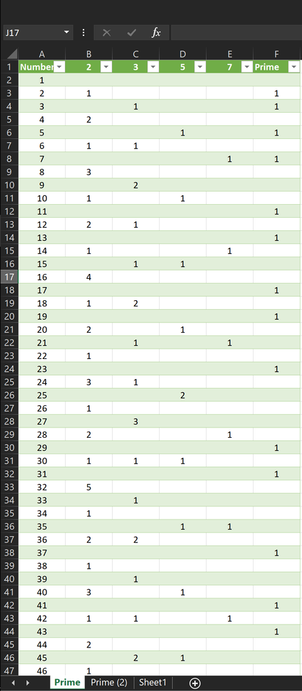
    Note: my table, named "Primes," has other columns for determining if the number is prime. It's just an existing table I have around--you just need one column with a series of whole numbers.
    powerapps primes.png


  2. Insert a Slider. This slider is for testing purposes and longevity of this solution. At the moment, a gallery can only show 100 records at a time even if its formula is delegable. That means even calculations will only process the 100 shown until you scroll down for more. Should this limitation ever change, you can tweak this Slider accordingly.

    This slider will range from 100-500 and will represent the number of records that will be displayed in each interval, and thus, nested gallery.
    Change Slider1.Min to:
    100
    
    Change Slider1.Max to:
    500
    
    Change Slider1.Default to:
    100
  3. Insert a Button that will determine the first and last record of your datasource. This information is used to determine how many n groups of 100 amount of records are actually in your datasource. If your datasource has 500 records, it has n=5 groups of 100 records.

    Set(firstRecord,First(datasource));
    Set(lastRecord,First(Sort(datasource,RecordId,Descending)))

    This means firstRecord is the first record in the datasource. The last record in the datasource is determined by sorting the datasource descending starting with the one with the highest ID number (RecordId), then taking the first result. Unfortunately Last(datasource) doesn't seem delegable.

    Note: RecordId is a field that is unique and automatically created for numbering each record in CDS. Replace this with whatever is the unique ID field for your records.

  4. Insert a gallery whose Items property is set to your table of whole numbers. 
    Add columns to the table to determine which set of 100 records a record belongs to. I do this in PowerApps instead of the Excel table because it is a more flexible solution.

    AddColumns(
        Filter(Primes,
            Number<=RoundUp((lastRecord.RecordId-firstRecord.RecordId)/Slider1.Value,0)
    ), "min",(Number-1)*Slider1.Value, "max",Number*Slider1.Value )

    Orange
    My table of whole numbers is called "Primes."

    Green and Blue
    The table of whole numbers will be filtered to show only the whole numbers less than or equal to n as calculated in blue. This means if you subtract the ID of the first record from the ID of the last record and divide it by 100, the default value of Slider1, you'll find out how many groups of 100 are in your datasource.

    Note: if your unique identifier is not configured as a value, consider wrapping it in Value() or multiplying by 1.

    Magenta
    The filtered table has columns "min" and "max" added that will later be used to calculate the range of records for each interval: 1-100, 101-200, 201-300, etc. for x=100. If you adjust the Slider, this gallery will attempt to show that number of records in the nested gallery. It doesn't work yet.

    Number is the name of the column in which the whole numbers are listed.

  5. Insert a gallery into your parent gallery. I'll refer to it as the "nested gallery" or "child gallery." 

    Change the Items property of the nested gallery to:
    Filter(datasource,
        RecordId>=firstRecord.RecordId+ThisItem.min,
        RecordId<firstRecord.RecordId+ThisItem.max
    )

    This means that each record in the parent gallery will show a child gallery that houses the records from your datasource that fall in different intervals of 100. The first child gallery will show records 1-100, the second child gallery will show records 101-200 and so on.

    The unique identifier RecordId must fall between a number greater than the minimum and maximum values calculated in the previous step. Everything is relative to the first record which doesn't change for our purposes.

    Note: again, if your unique identifier (RecordId) is not configured as a value, consider wrapping it in Value() or multiplying by 1.

  6. Insert a Label inside the child gallery to show some data that will help you see that it is working.


___________________________________


Checkpoint:

At this point, you should be seeing 100 records in each child gallery until it reaches the n number of groups of 100.


Gallery Control - How to Paginate Data

 Pagination

 When learning jQuery, various plug-in program attracted me. One of the useful plug-in program for data viewing is “Pagination”.


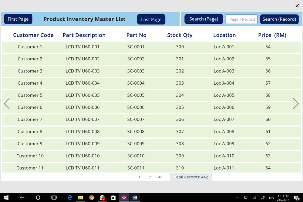
Today, I spare some free time and wish to share how to utilize PowerApps simple formulas to create the same function.

Formulas used in creating pagination cover only:

- If

- UpdateContext

- RoundUp & RoundDown

- CountRows

- LastN & FirstN


Screen OnVisible (Loaded) &amp; First PageScreen OnVisible (Loaded) & First Page


Step 1


Screen:


Screen1.OnVisible:

UpdateContext({iter: 0});

UpdateContext({iter: RoundDown(Gallery1.Height/Gallery1.TemplateHeight,0)}); FirstN(Table1, iter)


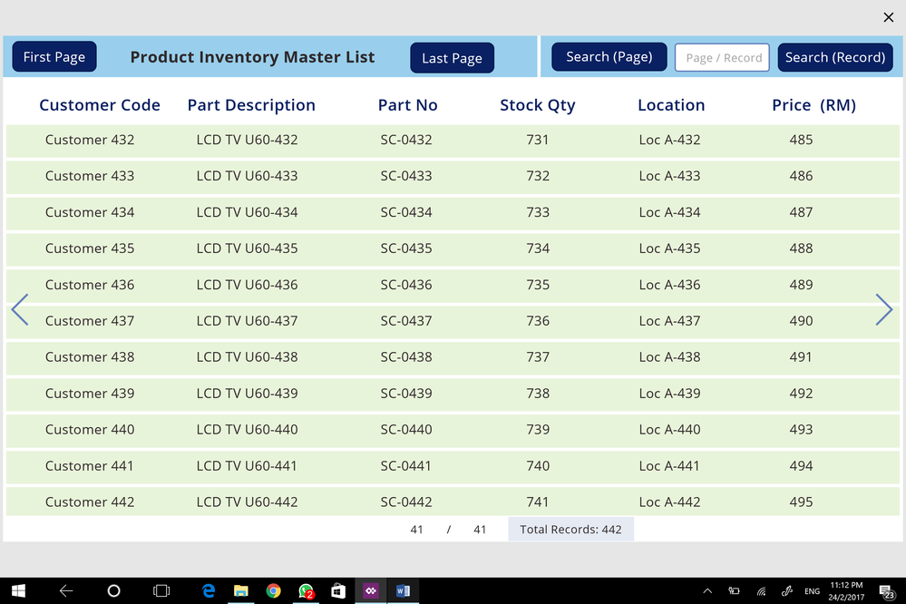
When screen is loaded, it will display Gallery with Number of Rows as determined by “RoundDown(Gallery1.Height/Gallery1.TemplateHeight,0)” using FirstN(Tale1, iter)


Data


- Add datasource to your PowerApps (I have attached complete sample PowerApps but using Static Data, so that no connection is necessary to faciliate apps learning)

- Add a Gallery, with items connected to datasource


Gallery1.Items = LastN(FirstN(Table1, iter), RoundDown(Gallery1.Height/Gallery1.TemplateHeight,0))


Note:

Gallery1.Height/Gallery1.TemplateHeight is used to calculate “Viewable Number of Rows”.

This is a dynamic formula because when you manually adjust the Gallery1 Height using mouse, the formula will calculate automatically.

The same is also used for “Calculating No. of Page”.


Step 2


Showing Page No. / Total No. Page


Page No.:

RoundUp(iter/RoundDown(Gallery1.Height/Gallery1.TemplateHeight,0),0)

Total No. of Page:

RoundUp(CountRows(Table1)/RoundDown(Gallery1.Height/Gallery1.TemplateHeight,0),0)


Step 3


Cick on First Page or Last Page are common functions.


First Page: (Use FirstN)

UpdateContext({iter: RoundDown(Gallery1.Height/Gallery1.TemplateHeight,0)}); FirstN(Table1, iter)


Last Page: (Use LastN)

UpdateContext({iter: CountRows(Table1)}); LastN(Table1, iter)


Last PageLast Page


Step 4


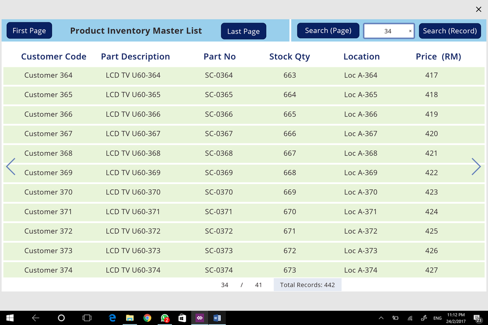
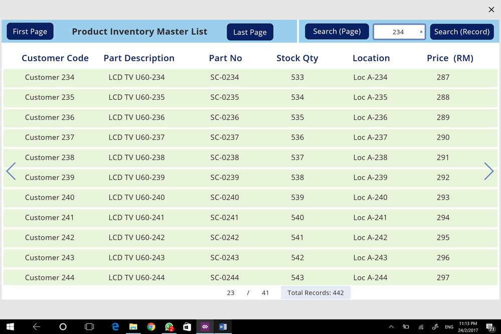
Users may opt to search by "Record" or "Page". This is a quick search method.


Search (Page):

If(Value(SearchInput.Text) <= RoundUp(CountRows(Table1)/RoundDown(Gallery1.Height/Gallery1.TemplateHeight,0),0), UpdateContext({iter: Value(SearchInput.Text)*RoundDown(Gallery1.Height/Gallery1.TemplateHeight,0)}))


If formula allows only searching within “Total Pages


Search (Records):


If(Value(SearchInput.Text) <= CountRows(Table1), UpdateContext({iter: Value(SearchInput.Text)-1+RoundDown(Gallery1.Height/Gallery1.TemplateHeight,0)}))


If formula allows only searching within “Total Records


Search &quot;Page&quot; functionSearch "Page" functionSearch &quot;Record&quot; functionSearch "Record" function


Step 5


Next Page:

If(iter < CountRows(Table1), UpdateContext({iter:If(iter < CountRows(Table1), iter+RoundDown(Gallery1.Height/Gallery1.TemplateHeight,0))}))


If formula will detect if the record has “Come to the End of Records” based on iter < CountRows(Table1)


Previous Page:

If(iter < 2*RoundDown(Gallery1.Height/Gallery1.TemplateHeight,0), UpdateContext({iter: RoundDown(Gallery1.Height/Gallery1.TemplateHeight,0)}); FirstN(Table1, iter), UpdateContext({iter:iter-RoundDown(Gallery1.Height/Gallery1.TemplateHeight,0)}))


If formula will detect if the record has “Come to the First Record” based on iter < 2*RoundDown(Gallery1.Height/Gallery1.TemplateHeight,0)


References:

 http://powerappsguide.com/blog/post/gallery-control---how-to-paginate-data

 https://powerusers.microsoft.com/t5/Power-Apps-Community-Blog/Pagination-Features-Esp-for-PC-or-Tablet-Mode/bc-p/116541#M256


Top 5 reasons to choose PowerApps

 With so many other mobile development tools on the market, why choose PowerApps? Here are 5 compelling features.

  1. PowerApps requires no programming experience. It provides a graphical designer that we can use to visually build our apps. PowerApps is based on Excel and the designer includes a formula bar, just like Excel. The language that PowerApps uses shares many of the same function names with Excel. Therefore if you know how to use Excel, you'll feel familiar with PowerApps.
  2. We can easily access company data sources from within PowerApps. Businesses frequently store data in SharePoint or SQL servers inside internal company networks. We can access this data by installing a gateway program on a computer inside the internal network. This provides a simple, non-programmatic way to make internal company data accessible from the mobile apps that we create.
  3. Simple deployment. We can make our apps available to end users through the sharing and publishing features in PowerApps. Compared to other methods of mobile development, there's no need to register for iOS developer accounts, obtain security certificates, or work out how to deploy Android APKs to devices.
  4. PowerApps provides access to hardware features on mobile devices, such as location services and cameras. We can retrieve the GPS location of a device, as well as compass and acceleration values. PowerApps also provides a pen control to capture signatures, and also provides barcode recognition capabilities.
  5. Finally, PowerApps provides lots of rich features, such as the ability to display charts, maps, and videos. We can also access a wide range of cloud services which includes services from Google, Adobe, Salesforce, and many other third party companies.

Delegation - How to overcome the 500/2000 Row Limit with Collections

 At some stage, most of us will encounter the need to overcome the row limits for non-delegable queries. This is necessary to provide data aggregation for reports and charts, allow better searching of data with more specific search criteria, and many other reasons.


The best reference guide for this is Mr Dang's post here:


In this excellent post, Mr Dang describes how to use a ForAll loop to collect records into a local collection in batches of 500. You can find a full description of how to implement this technique in Mr Dang's post, but here's a brief extract. Well done Mr Dang!

UpdateContext({firstrecord: First(datasource)});
UpdateContext({lastrecord: First(Sort(datasource,RecordId,Descending))});
UpdateContext({maxiter: RoundUp((lastrecord.RecordId-firstrecord.RecordId)/500,0)});

ClearCollect(iter,
	AddColumns(AddColumns(Filter(HundredChart,Number<=maxiter),"min",(Number-1)*500),"max",Number*500)
);

Clear(datasource_temp);
ForAll(iter,
	Collect(datasource_temp,
		Filter(datasource,RecordId>=firstrecord.RecordId+min && RecordId<firstrecord.RecordId+max)
	)
)

You can find other useful details of this topic in the posts here:


                                                 Or Another Article of Delegation  

This solution makes it possible for you to avoid making a column that calculates which block of 500 a record belongs to (I previously used a column called n). I made my formulas based on a CDS entity and performed calculations on the default RecordId field which is a Big Integer. I previous was using PrimaryId, since it was small numbers starting at 1, but the problem is that it is handled as text. RecordId is a value at least.


UpdateContext({firstrecord: First(datasource)});
UpdateContext({lastrecord: First(Sort(datasource,RecordId,Descending))});
UpdateContext({maxiter: RoundUp((lastrecord.RecordId-firstrecord.RecordId)/500,0)});

ClearCollect(iter,
	AddColumns(AddColumns(Filter(HundredChart,Number<=maxiter),"min",(Number-1)*500),"max",Number*500)
);

Clear(datasource_temp);
ForAll(iter,
	Collect(datasource_temp,
		Filter(datasource,RecordId>=firstrecord.RecordId+min && RecordId<firstrecord.RecordId+max)
	)
)


There are three parts:


1. Determine the first record (firstrecord), the last record (lastrecord). Subtracting their RecordId value and dividing it by 500 determines how many times you would need to perform iterations (maxiter). The firstrecord's RecordId will be used as a reference for pulling in records later.


UpdateContext({firstrecord: First(datasource)});
UpdateContext({lastrecord: First(Sort(datasource,RecordId,Descending))});
UpdateContext({maxiter: RoundUp((lastrecord.RecordId-firstrecord.RecordId)/500,0)});


2. Make a static table of whole numbers [1, 2, 3, ... 100 or whatever you want]. Filter it to use as the argument in ForAll later. It will give instructions to ForAll on how many times to "loop." So if in step 1, you determined that your number of iterations (maxiter) was 3, then the formula would Filter all whole numbers less than and equal to 3.


Note: my formula below is messy. I am using an existing table I have that only has a column with whole numbers. I had to add columns for the minimum 500 and upper 500 using AddColumns(). You may opt to make those columns in your table so it does not need to be calculated every time. I figure it's a small calculation so it's not a big deal.


ClearCollect(iter,
	AddColumns(AddColumns(Filter(HundredChart,Number<=maxiter),"min",(Number-1)*500),"max",Number*500)
);


3. The last part is where the formula pulls in records. First it clears the temporary collection (datasource_temp) that is used for holding the records. ForAll will pull in 500 records at a time for each whole number you Filtered in step 2. So if you have 3 whole numbers in the iter Collection (maxiter=3), then ForAll will pull in:

  • all records with RecordId>=firstrecord.RecordId+0 and RecordId<firstrecord.RecordId+500
  • all records with RecordId>=firstrecord.RecordId+500 and RecordId<firstrecord.RecordId+1000
  • all records with RecordId>=firstrecord.RecordId+1000 and RecordId<firstrecord.RecordId+1500
  • then it will stop because there are no other whole numbers in the "iter" Collection.


Clear(datasource_temp);
ForAll(iter,
	Collect(datasource_temp,
		Filter(datasource,RecordId>=firstrecord.RecordId+min && RecordId<firstrecord.RecordId+max)
	)
)


                    Or Another Article of Delegation  

Now that I've had some time to play with ForAll, I have a more elegant solution for pulling in 500 records at a time for reading. I still do not have a good solution for writing though. For this to work, you will still need a column in your Entity which describes which set of 500 it belongs to.


Big idea: 

  1. Find out what the maximum n value is that describes how many sets of 500 you have. The formula I included also repairs the datasource if the last entry did not correctly have an n recorded.
  2. Create a dummy collection that includes whole numbers that are less than or equal to the n value you found in step 1.
  3. Use the dummy collection in step 2 as an argument in ForAll--"For each n in the dummy table, collect the 500 records from the datasource which are equal to that n."


UpdateIf(datasource,IsBlank(n),
	{n: RoundDown(Value(PrimaryId)/500,0)+1
	}
);

UpdateContext({maxn: First(Sort(datasource,PrimaryId,Descending))});

ClearCollect(iter,
	Distinct(Filter(HundredChart,Num<=maxn.n),Num)
);

Clear(datasource_temp);

ForAll(iter,
	Collect(datasource_temp,
		Filter(datasource,n=Result)
	)
)

This can be done in a Button, Toggle, Timer, or whatever you want to trigger.


The only requirement is that you create a Table of whole numbers in a column [1,2,3,4,5, etc.] from which to pull your dummy collection. You can connect it to PowerApps as static data. I just used an existing "Hundred Chart" from a datasource I already connected. I do not know another way of making a collection with such whole number sets.


EDIT: Unfortunately, you will need to create an n value in your entity. I tried the following formula to try working around writng a column for n, but it has service limitations:


ForAll(iter,
	Collect(datasource_temp,
		Filter(datasource,(RoundDown(Value(PrimaryId)/500,0)+1)=Result)
	)
)


EDIT2:

Since UpdateIf does not delegate, you will not be able to fix all n that are blank. Instead, when writing a record, write n as 0 instead of blank so you can fix it. The change below can only fix the last record and may miss any others that do not have an n.

UpdateContext({maxn: First(Sort(datasource,PrimaryId,Descending))});

If(IsBlank(maxn.n) || maxn.n=0,
Patch(datasource,First(Filter(PrimaryId=maxn.PrimaryId)), {n: RoundDown(Value(maxn.PrimaryId)/500,0)+1 } )
UpdateContext({maxn: First(Sort(datasource,PrimaryId,Descending))})
); ClearCollect(iter, Distinct(Filter(HundredChart,Num<=maxn.n),Num) ); Clear(datasource_temp); ForAll(iter, Collect(datasource_temp, Filter(datasource,n=Result) ) )