
We will work on two simple limitations on the current controls in Canvas Apps and create custom components to overcome those limitations.
1. A specific range cannot be set on the date picker control that would limit the users from selecting dates from a specific range only.
2. Power Apps currently limits the text input control to two formats i.e., text and number. We will create a custom component to support ‘regex’ as a general setting that can be applied to multiple input fields of the same format. Let’s get started. We will first create the components and then see how to use them on the canvas app.
Creating Custom Components
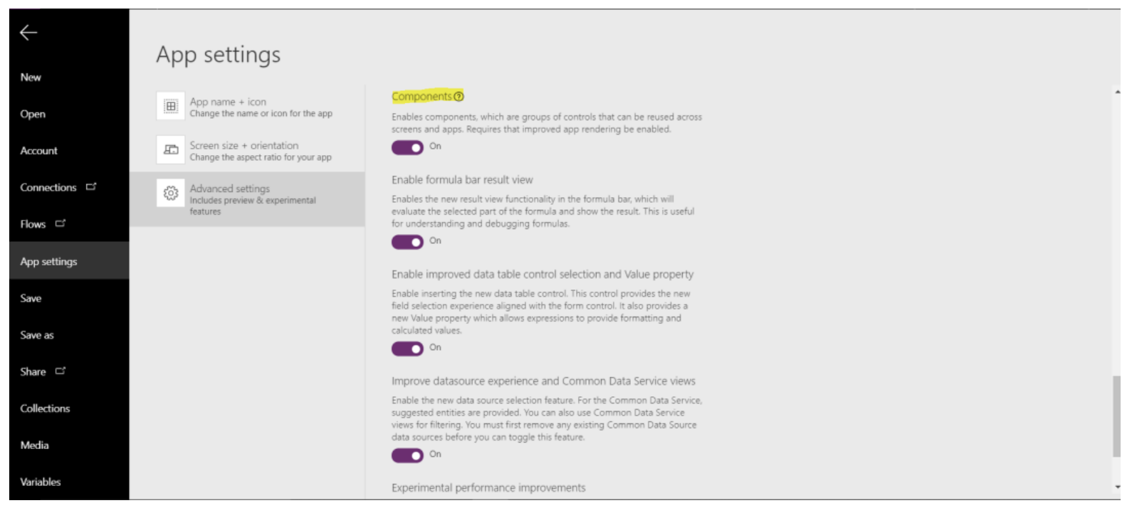
To create the components in the Power Apps app studio, we first have to enable ‘Components’ in the experimental features tab from the advanced settings of the app.
Date Picker
The current date control allows you to restrict only the year while configuring the control. Using already available controls, we can design a component for the date control that enables restricting to a range of dates. The display of the date control component is based on a gallery and is explained in detail here. We will start by creating a few custom properties for the component. The idea behind this date control is to enable functionality to restrict users to select the date from a specified range. For this, I created a “start date” and an “end date” property of data-type “date and time”. I have also added properties to customize the color of the different sub-controls of the component.
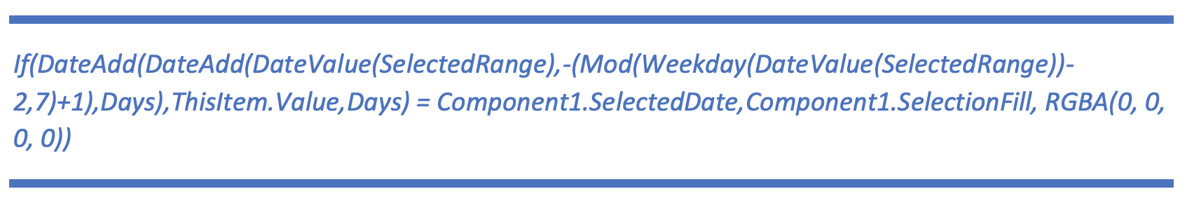
1. This is a label that displays the date selected from the custom date picker control component. The expression used on the “Text” property of this label: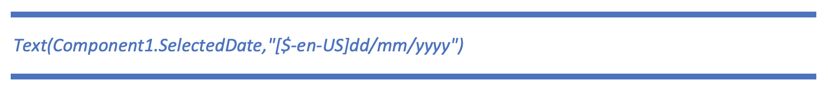
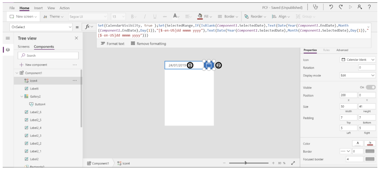
2. This is an icon (‘calendar’) to expand the date picker. The expression used on the “OnSelect” property of this control:
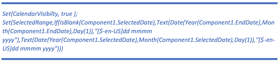
Explanation: The visibility of the calendar is set here based on the “CalendarVisibility” variable. “SelectedRange” is a variable that sets the context for the appropriate month to be displayed on the date picker.
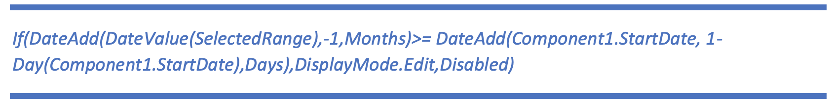
3. Upon clicking this icon, the user is navigated to the previous month. The expression used on the “OnSelect” property of this control is:
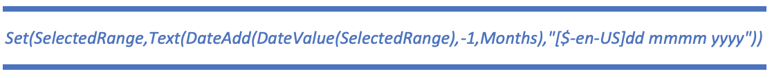
Explanation: This evaluates the month label based on the current month on the date picker and the result is the previous month w.r.t to the current month. The expression used on the “DisplayMode” property of this control:
4. This is a label control and displays the selected month and year on the date picker.
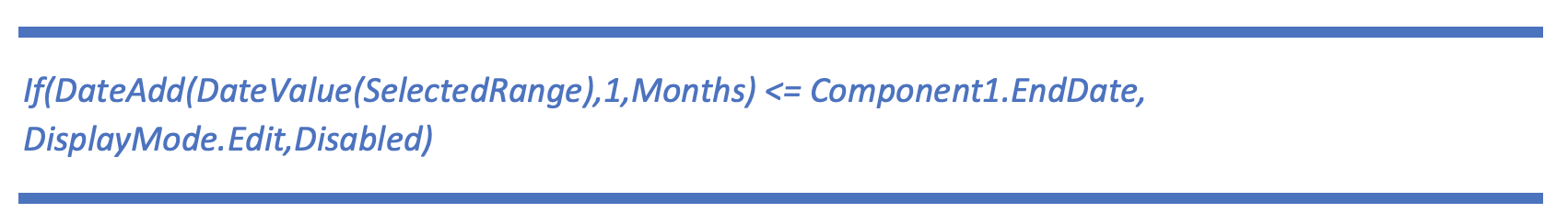
5. Upon clicking this icon, the user is navigated to the next month based on the current month. The expression used on the “OnSelect” property of this control is:
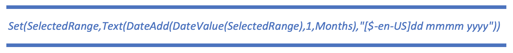
Explanation: This evaluates the month label based on the current month on the date picker and the result is the next month w.r.t to the current month. The expression used on the “DisplayMode” property of this control:
6. This is a gallery of buttons to show days week wise in a row. The expression used on the “OnSelect” property of the button inside of the gallery is:
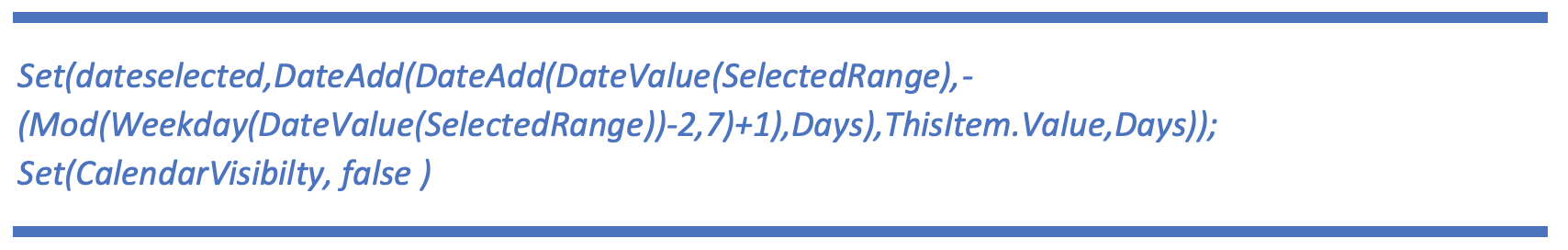
Explanation: The “dateselected” variable value is set by clicking this button. The expression used on the “DisplayMode” property of this button control is:
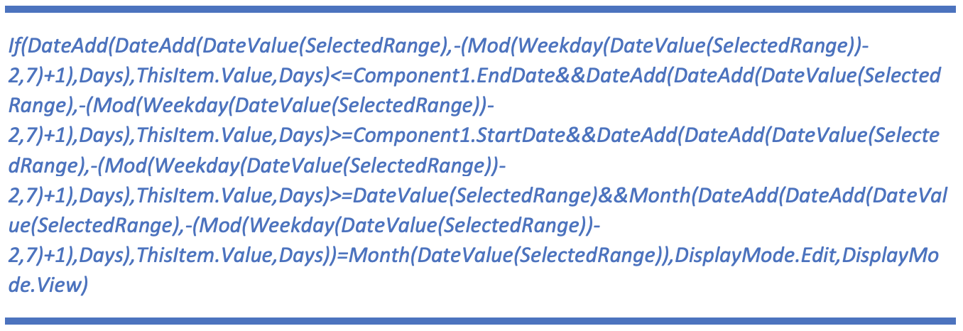
Explanation: Here is the date validation that checks if the date is within the range of the “start date” and “end date” properties and is of the currently selected month. The expression used on the “Text” property of the button control is: (This expression has been referred from this reference link.)
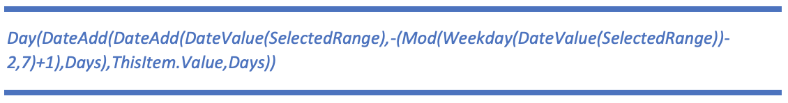
Explanation: This gets the date as per the day from the date picker. The expression used on the “Items” property of the gallery control is: (This expression has been referred from this reference link.)
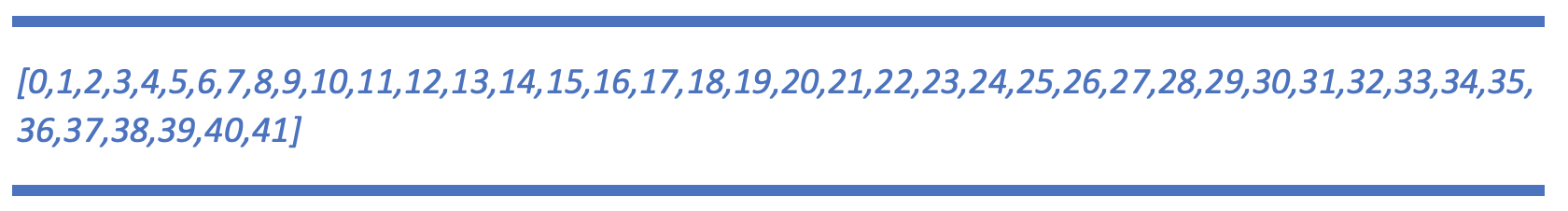
Explanation: This created the 42 cells for the date picker inside of the gallery control. The expression used on the “TemplateFill” property of the gallery control is:
Explanation: This highlights the currently selected item (date) in the gallery control.
The selected date from this component can be accessed through the “SelectedDate” property. Note: The color properties defined are used in the component on all the individual controls to sync the color coordination amongst them.
Regex
The current text input control allows you to choose the input text format as a number or text only. We can design a component that allows implementing regex and based on the property (formatting required) the text input can be formatted or restrict the user to input the text in the type defined in the component. If the input text does not match the type chosen on the component, the field is reset, and a warning message is displayed to the user.
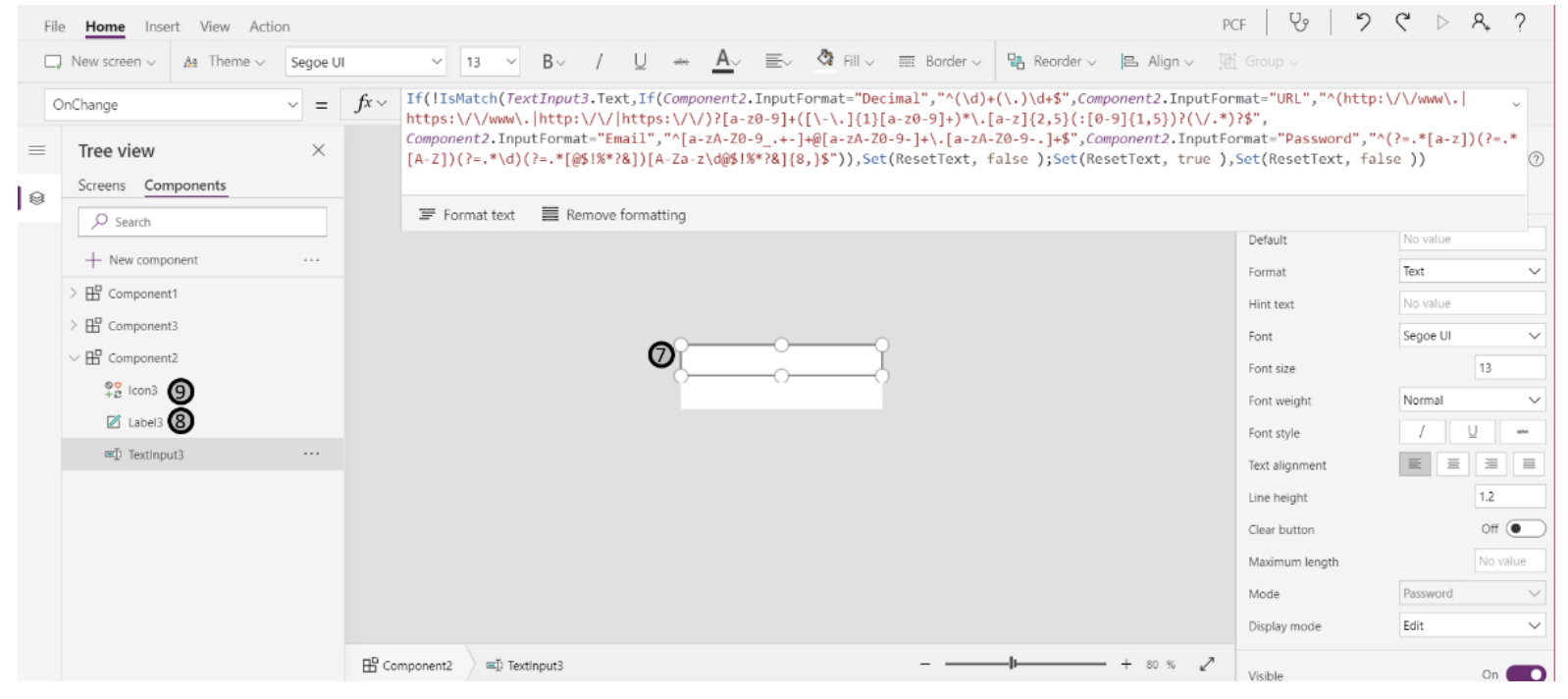
7. This is a text input control and the text format is set through the “InputFormat” custom property created on this component. The expression used on the “OnChange” property of this control is:
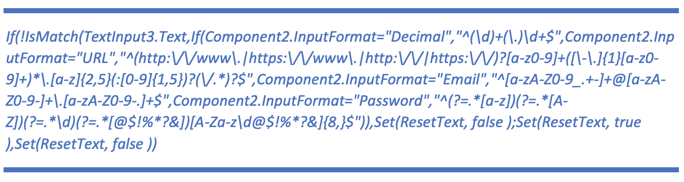
Explanation: The “if” statement checks the “InputFormat” custom property for the text input against the respective regex statement and resets the input if the regex is not matched. The expression used on the “Mode” property of this control is:

Explanation: If the “InputFormat” on this component is set to “Password” then the mode will be set to password in order to mask the user input.
8. This is a label that is used to display the warning message to the user in case of a mismatch of the input based on the “InputFormat” property.
9. This is an icon used to display the warning sign to the user in case of a mismatch of the input based on the “InputFormat property.
Email:
This is an “InputFormat” and the regex that this type of input is being compared to is:

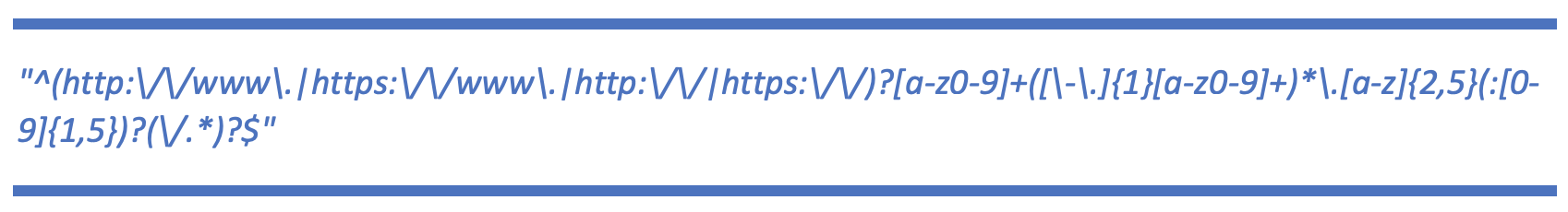
URL:
This is an “InputFormat” and the regex that this type of input is being compared to is:
Password:
This is an “InputFormat” and the regex that this type of input is being compared to is:
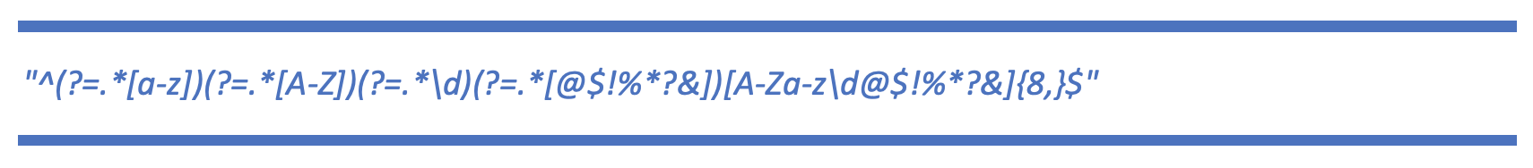
The password should include at least one or more of an upper case, lower case letters, a number, and a special character.
Number Format:
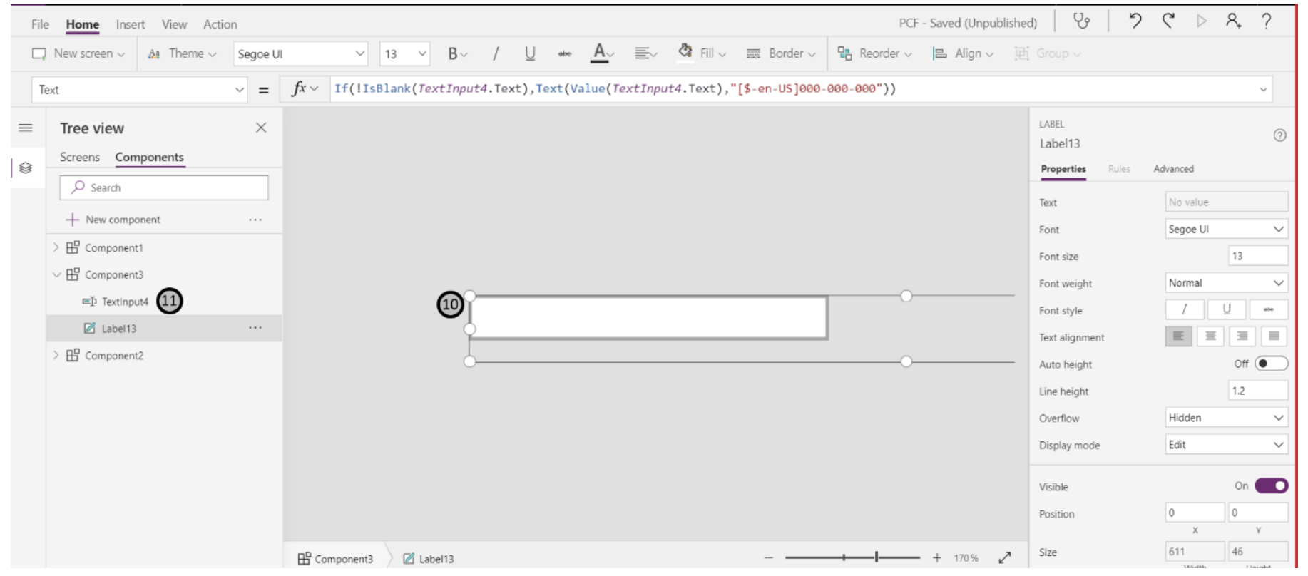
10. This is a label that displays the converted value based on the formatting defined for the input number. The expression used on the “Text” property of this control is:

Explanation: If the text input is not empty, then the numbers entered will be formatted as “XXX-XXXXXX”
11. This is a text input control and the user will enter the number in this control. The “Format” property of this input is set to “Number” Note: The label in 10 is positioned in a way that it overlaps the text input control in 11. That is how the user can see the input formatted as set in the label.
Using the Custom Components
Currently, Power Apps restricts the use of a component in galleries, data cards, data tables, etc. We will design a custom sign up form and use the components created above to register a user and save the information on the data source.
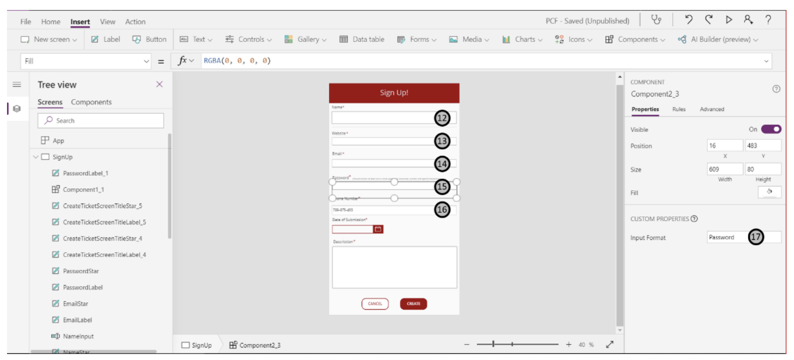
12. This is a regular text input field that will allow users to enter simple text. The property of this control is set to “text”.
13. This is a component that we have created earlier and the property for this is set to “URL”. When users enter the URL, it is matched against the regex and if it is not in a valid URL format the field is reset.
14. This field expects the input to be in the form of an email address. The component created earlier is used for this control and the property is set to “Email”. If the input does not match against the regex for email, the field will be reset and a warning message will be displayed.
15. The property on the component for this is set to “Password”. If the input does not match as the regex set for the password (as mentioned next to the “Password” label), the field will be reset and the warning message will be displayed.
16. This input field expects the input in the form of a “Phone Number” and appends the ‘-’ to the numbers entered based on the regex configured while creating the component.
17. The custom property created for the component can be set here. For each of the above fields, the type of input (regex expression) is defined by setting this property.
 18. This is the date control component and allows the user to pick a date by clicking on the calendar icon.
19. The custom properties for the date control component can be set here. The start date and the end date are configured to set a range of allowable dates. As an added feature, the colors for the individual controls within the date picker can also be configured here.
20. This is a clear field button and upon clicking this all the fields are cleared and the user creates a new entry.
21. This is a submit button and the user can submit their details by filling the form and pressing this button. Upon pressing this button, the details filled by the user are patched to the respective columns in the data source.
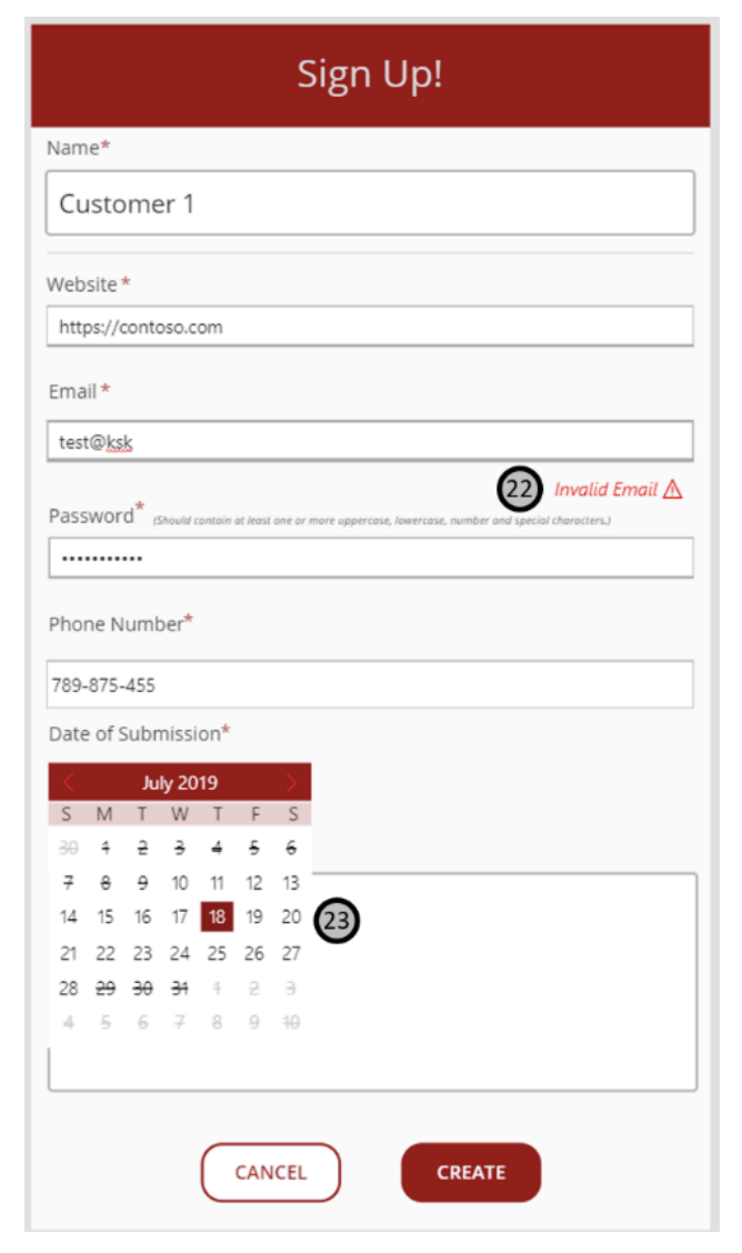
22. This is a warning generated for an inappropriate email address format that was entered by the user. As soon as the user clicks outside of this control, the field is reset.
23. This is the expanded date picker control and the dates that can be selected by the user are based on the start and end dates range configured in the app. The dates that cannot be selected are highlighted by the strikethrough and the buttons to navigate to the next/ previous months is disabled.
No comments:
Post a Comment